Data » information » knowledge: Medialab designers discuss the role of visualisation in the research process
In addition to data acquisition and analysis, the subsequent step of data visualisation is a central task that the Medialab team faces as part of the study of the culture cycles in Katowice under the Shared Cities project. As one of our previous postings has already covered the challenges facing our coders, this time we talk to Medialab designers. Paulina Urbańska and Waldek Węgrzyn work on the visual side of the project on a daily basis, while constantly improving our research methodologies and internal team communication.
Łukasz Mirocha, Paulina Urbańska, Waldemar WęgrzynInterview
Waldek’s role within the project involves the visualisation of downloaded and analysed data. He is always on the lookout for a visual form that helps reveal new information, patterns, and regularities. He is responsible for the design designs and programming of visualisations and tools, both for internal Medialab use, and those that will be available in installation form at the exhibition or on the web. He also participates in data processing and analysis at earlier research stages.
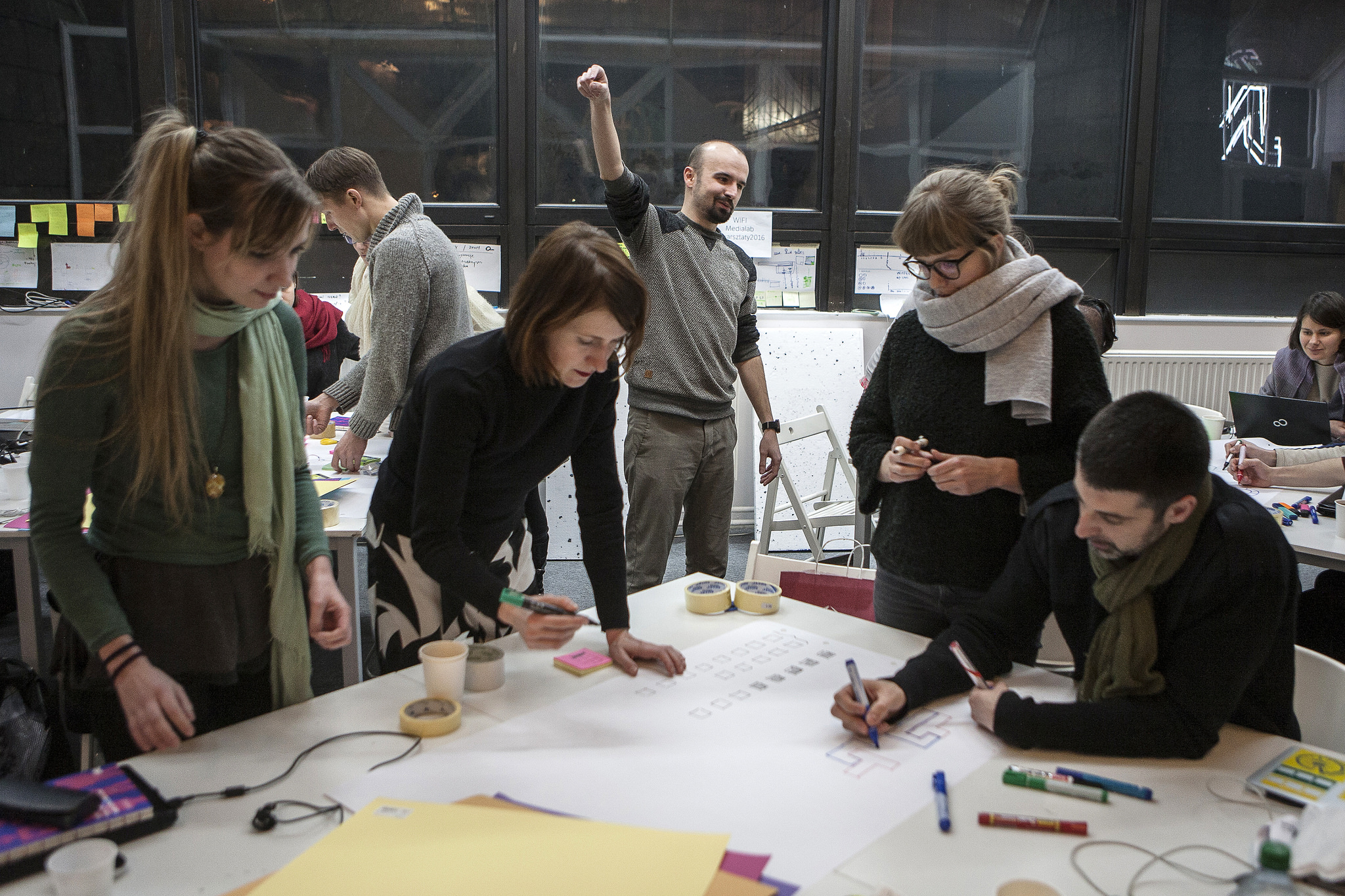
Paulina is responsible for developing design frameworks for the visualisation tools with which to illustrate the state of culture in Katowice. The methodology and tools she uses to streamline team decision-making and select appropriate visual solutions are based on design and visual thinking. This kind of approach translates directly into a practice of visualising our research results on an ongoing basis, and has a bearing on the decisions relating to the final exhibition and the promotional strategy for the Shared Cities project in Katowice.
- Łukasz Mirocha: What tools do you use to design and share visualisations? Do you also develop your own solutions from scratch?
Waldek: Due to the large amount of data and iterative nature of work, I have almost completely abandoned creating visualisations created ‘manually’ using graphics editors, such as Adobe Illustrator. Instead, I try to learn the tools that allow me to dynamically generate once prepared charts for many consecutive data sets. Currently, most of our research results are visualised using two JavaScript libraries: highcharts and d3.js. For prototyping and exploratory visualisations, we use a number of tools, such as RAWGraphs, Plotly, and Gephi, as well as charts generated during data analysis in R.
Paulina: As regards the ongoing visualisation of the results, I offer support with the styling of visualisations at the final stages of the process. This mainly involves delivering visualisation components that later get into programmed in with e.g. d3. Such graphic components, normally created as vector objects in Adobe Illustrator, are then used to develop systems for different types of visualisations.
- Suppose we treat visualisations as interfaces to access a dataset. What criteria are used for the selection of ‘best available’ visualisation? What steps should be taken to create a visualisation based on a collected data set?
Paulina: Regardless of the operational pattern chosen, the three milestones of data> info> knowledge are always present in any instance of information processing. This means that in order to find out what a particular data set contains, we need to know its organisation. It is the careful study of the data that allows us to see the information contained in them and capture the relevant items.
Waldek: First off, you need to learn the structure of the set, analyse the data itself, and select interesting threads. These activities usually involve several people – the important thing is that a designer should already be involved at this stage. The resulting visualisation should reflect the structure of the data (e.g. continuous numerical data can be presented as a line charts, which cannot be applied to categorical data). On the other hand, what must also be taken into account is the recipient along with their knowledge and skills.
We usually aim for the most appropriate solution from among existing and proven chart types. Occasionally, however, it is preferable to opt for a custom visualisation to present a specific data set.
Paulina: The essential question arises once we make the decision of not what the visualisation is supposed to be, but what purpose it is supposed to serve. It is then difficult not to reckon with the context of the recipient and the project’s manner and the purpose of use. Knowing what kind of effect our visualisation is supposed to produce, or the purpose it is meant to serve, we will be able to decide if it needs to explain an issue or draw attention to it (e.g. to visitors of an exhibition), support exploration activities(e.g. of a city researcher or the team continuing work on a given data set), or induce a change of attitude and spur to action – as the case might be with a decision maker in control of the city’s cultural policy.
- How do you create an action plan for a visualisation and how much it is related to the data analysis stage?
Waldek: The biggest challenge is to create a visual message that is clear and intelligible to the recipient, and at the same time does not favour simple conclusions by oversimplifying the issues under exploration.
Paulina: Processing data into a visualisation is so complicated that it would be difficult to carry out without systematising the operation. The process is less daunting when we divides into manageable steps. For me personally, the best way is to divide it into the sphere of the problem, where we develop a concept based on the research carried out, and the sphere of the solution, i.e. making design decisions that are relevant to the conclusions drawn in the research.
Waldek: It is worth adding that at this stage, we rely both on the exploratory and the visual dimension of the visualisations to prepare the summaries for each stage of the activity (e.g. on the blog). These are both working analyses we use to gain insight into the data, and a way to communicate work progress to all those interested.
- How do you handle the problem of inconsistent data sets and misleading information that may interfere with the visualisation? Do you work with the encoder team from the beginning?
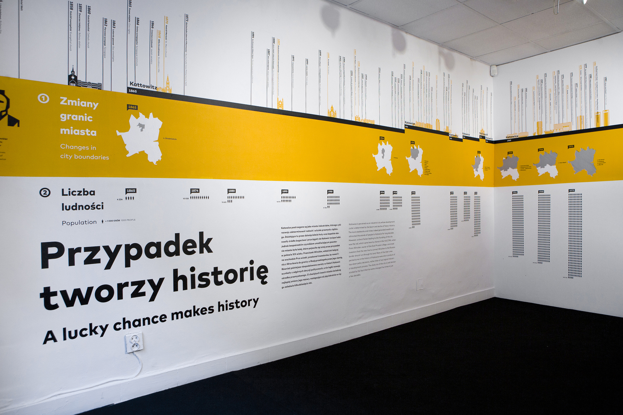
Paulina: This is a serious issue that we wrestle with on a daily basis. I do not participate in every stage of data acquisition and processing, but I have kept track of it long enough to be able to understand the importance of properly collected data, its preparation (cleaning), and how these steps impact on the quality of the process of creating a visualisation. We have gained experience in this matter while working on the exhibition Appetite for Radical Change visualizing 150 years of Katowice’s history.
We had mostly historical data available, which for many reasons has been collected in different ways: following different aggregation patterns or collected so unsystematically that in many cases they could not be compiled. Eventually, we managed by picking those workable data sets.
- Are the visualisations to be created at the end of the project going rely on both types of acquired and analysed information – raw data from social networks and traditional surveys?
Waldek: I would like to try combine these two sources. If it works, the challenge will be to present the two threads in a way that makes them complement each other (become interrelated), without comparing data types that are fundamentally different. I suppose this material is suitable for a multi-layered visual narrative in which conclusions from one area help to interpret the other one.
Paulina: I think we all intend to maximise the use of collected data and enable the compilation of survey results with content downloaded from Facebook, etc. For my part, I focus mainly on the usefulness of the resulting solutions (the means are less important) as well as on the effects they may cause. Demonstrating that the visualisation method using both types of data exists and works well, and that it can be used by someone else on top of that, seems a key benefit of our project.


