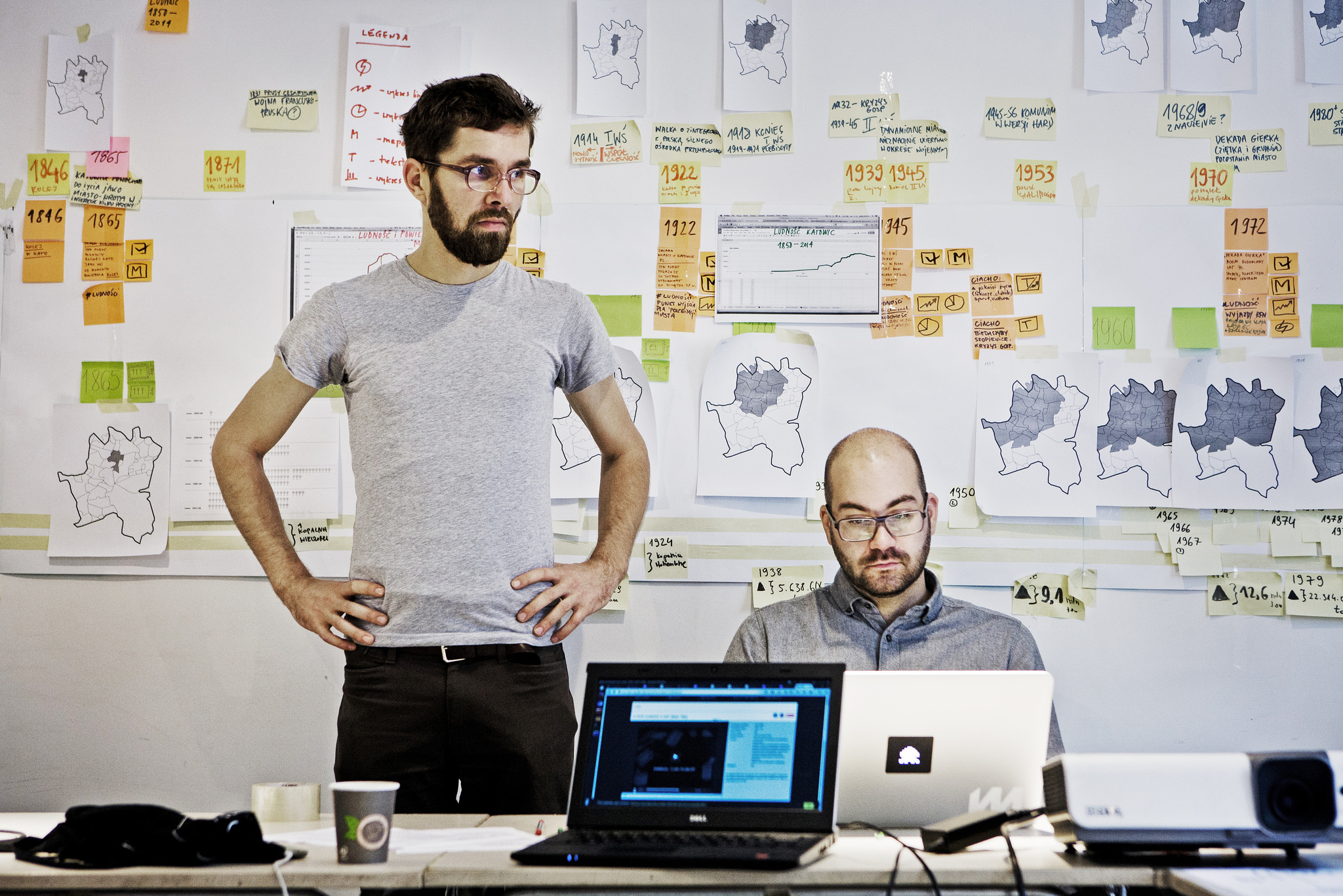
Studio NAND: There is nothing worse than a visualisation that tries to convey too much information at once
On January 9–10, Medialab once again had the pleasure of hosting Steffen Fiedler and Stephan Thiel of Berlin’s design studio NAND, who gave an open lecture, and conducted a two-day workshop for representatives of institutions working jointly on the Shared Cities project. In an interview given to Medialab, the data visualisation experts talked about their work, best visualisation practices and the future of the industry.
Łukasz MirochaInterview
Łukasz Mirocha: How do you define the role of data visualisation in contemporary research and cultural circulation? Is there a universal model, with which to visualise any data set?
Stephan Thiel: It would be difficult to identify a single, universal method of data visualisation. The selection of a suitable approach depends on the research questions and purpose of the project. Visualisation can be used in communication to tell a story, i.e. pick out some information from a larger set of data and give it a fitting visual form to build a narrative that helps present a problem or phenomenon in an innovative way. Another useful method is what is known as exploratory visualisation, which serves to deepen the knowledge of the studied phenomenon or problem and become a medium, or a lens, through which we can gain a new perspective on the issue.
Steffen Fiedler: In both cases, the visualisation creator takes on the role of the narrator or supervisor of the experience, whose job is not only to design the visual form, but also to perform appropriate data selection, taking into account the research objectives and target audience. Creating a successful visualisation necessarily starts with the informed preparation and cleaning of the data set. The next step is to design such forms of interaction and visualisation as to gradually or selectively show what is in that dataset.
ST: There is nothing worse than the visualisation that tries to convey too much information at once, e.g. a map with a large number of interactive information layers, overlapping each other at the same time. Too much content creates information chaos and clutter that ultimately fails to communicate a coherent message. We must also bear in mind that not all data sets lend themselves to visualisation.
Data analysis and visualisation usually requires the coordinated effort of many people. What skills or competencies should they have?
ST: The line-up of a team will depend on the complexity of the project at hand, based on its objectives and the size of the data set. First of all, we need an expert in the field of the visualisation’s subject matter. For instance, urban or cultural circulation projects will require the contribution of sociologists, cultural researchers and media experts.
SF: The team must also include professionals with ‘hard’ competencies, such as data analysts and mathematicians. The early conceptual stage will already require the involvement of the designer, who, either alone or jointly with the coder, will take care of the visual and technical aspects and design appropriate interaction and exploration mechanics.
In your projects, you often draw on the concept of research-driven design. What is it?
SF: We consider data-driven design from two perspectives. Methodologically, the approach involves making sure that the whole design process is conducted in the most structured way possible, with clear objectives, stages and product improvement methods. On the other hand, working with data is also an opportunity for the research team and the target audience to study a problem or phenomenon from a new point of view. Visualisation is often the culmination of work based on the conceptual triad of data, information and knowledge (and its dissemination).
New media and digital culture researchers are often critical of quantification, i.e. reducing more and more areas of our activity to data sets. Yet, isn’t visualisation based on digital data a chance to present cultural and social issues in a new form?
ST: Visualisation should be treated as an acultural tool, useful in reducing often very complex processes and phenomena to the visual form and thus facilitating the understanding of phenomena which are difficult to grasp when perceived at the raw quantitative data level. Therefore, the potential benefit of visualisation and research approaches such as data-driven design can be seen especially in the humanities and social sciences. In this type of projects, data serves as a starting point by providing a set of objective information and assumptions on which we agree, regardless of our views. Based on this data, we are able to formulate more precise research questions, while various visualisation help us reach a wider audience. Of course, you should remember not to fall prey to data fetishisation and maintain a certain distance.
What is the future of visualisation? Is the development of media technologies and new device and interface types going to bring about a radical evolution of today’s practice?
ST: In the future, we can expect interesting data visualisation implementations, especially within the urban fabric and architecture, and I’m not talking only about the visual aspect, such as interactive facades. There are new forms of interaction and information reporting based on haptic (ed. tactile) and auditory interfaces. We are in for engaging, multi-sensory experiences thanks to the development of wearable technologies, including smart clothes, sensors and the Internet of Things. I also envisage further growth of data visualisation as an interactive communication tool. Instead of static representation, which is dominant today, it would be great to see tools for remote teamwork on interactive visualisations with real-time modification features.
SF: Worthy of consideration in this context is also ensuring a growth in the area of visualisation literacy, so that visualisation can be transformed from merely a passive playback medium into a freely-modifiable work tool.
