Angeles Briones: Good visualization gives access also to data itself
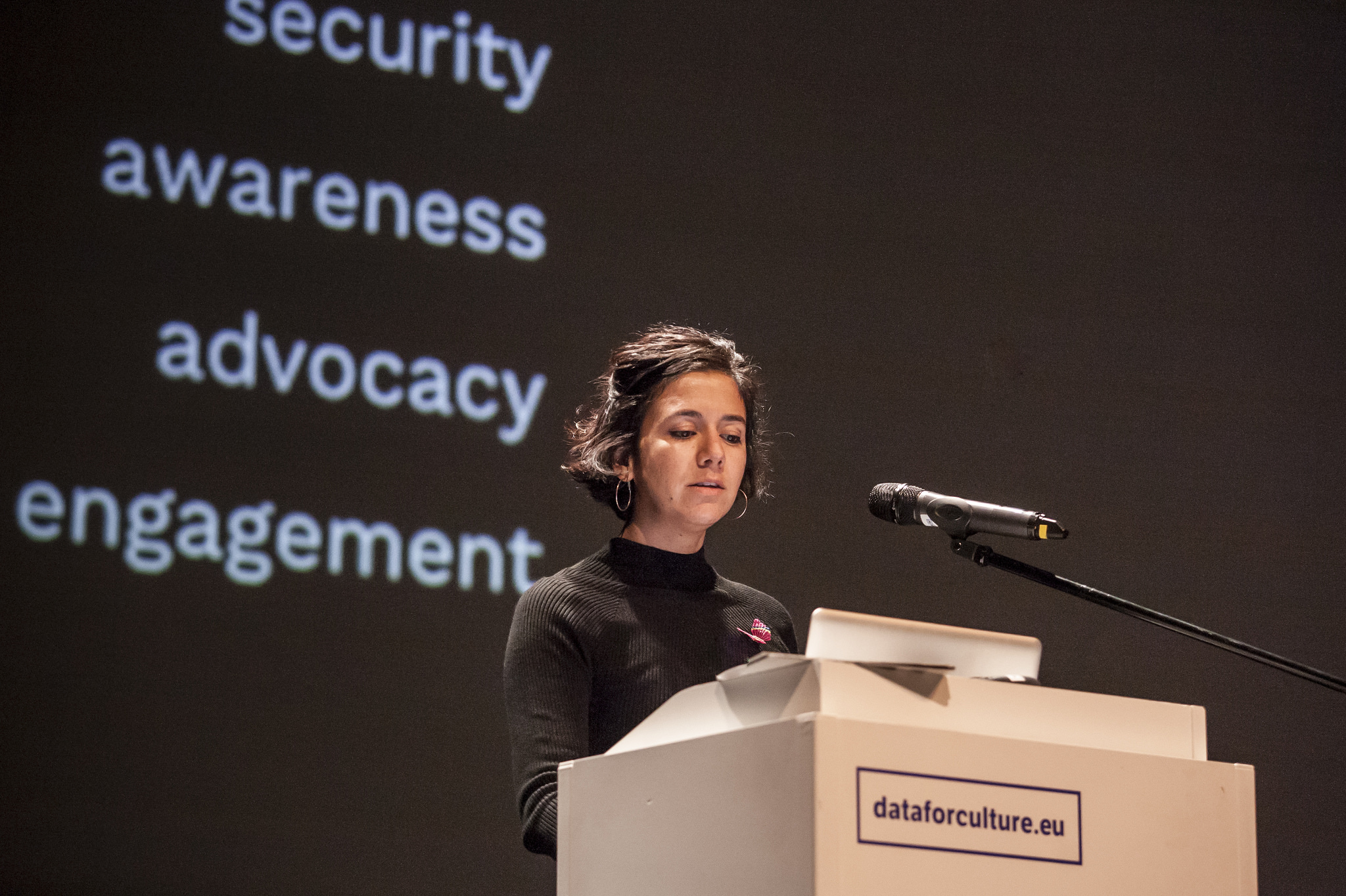
An interview on the role of the designer in research projects and on the future of visualization with Angeles Briones from DensityDesign Lab, Polytechnic University of Milan, who gave a lecture at the Data (for) Culture conference in Katowice.
Łukasz MirochaInterview
- Łukasz Mirocha: How do you understand the role of communication designers in today’s socio-technological context?
Angeles Briones: Communication designers have the chance to give communication a form so that it can become something meaningful for other people. The process of shaping communication involves technical and aesthetic techniques based on social and cultural contexts and different audiences’ backgrounds. Therefore, I see myself as a mediator or a translator. We, as designers, have a great responsibility in interpreting the audiences’ realities and giving information and messages a concrete form.
- Do you think that visualization as part of modern communication strategies is constrained more by the technical limitations of software or rather by the ‘illiteracy’ of the public that has not been prepared to make sense of it.
Reading visual messages is a part of our capabilities as a human species; ‘seeing comes before words’, says John Berger. Today, we have access to tools and data that we could not have imagined before, and with it comes the possibility of representing more complex messages. However, nowadays it’s easier than ever to create visualizations for the sake of visualizations, just because we have an abundance of data and tools to make it happen.
I think the biggest challenge today is to force ourselves to question the very rationale behind visualization. It is not about technical limitations or audience illiteracy, but about asking ourselves if we really need to apply visualization, i.e. if it indeed offers us something unique.
- Do you see education in visual communication /visualization as a necessary component of any formal and life-long education programmes?
Yes, I do. I think that the biggest challenge we have right now is to educate ourselves as designers and as audiences in order to go beyond reading the formal aspects of visual representations. I think there is a big challenge facing education and ethics regarding the use of data and its representations. From the formal point of view, there are already cases of the integration of reading visual images into public educational programmes.
- What other approaches can be combined with visualization to enhance its role as a social actor and agent of change? What about gamification, crowdsourcing digital mapping/cartography, storytelling?
The approaches you’re mentioning are certainly good practices to combine with visualizations for engaging and empowering people to use data actively. One approach that I personally think all designers working with data should try to achieve, is to design the transparency of the design process with data. This is not just publishing the final output of their work, but making available the databases, mentioning the sources, explaining which tools were used for scraping-cleaning-shaping the data, sharing the reasoning behind the design decisions that have been taken, etc. Perhaps not all visualisation projects may be transparent in the same ways but, for sure, there are aspects that could be shared with our audiences. It would give the audiences hint towards a better understanding of what they are seeing.
- Have you conducted any projects that follow the ‘transparency’ principle in applying visualization?
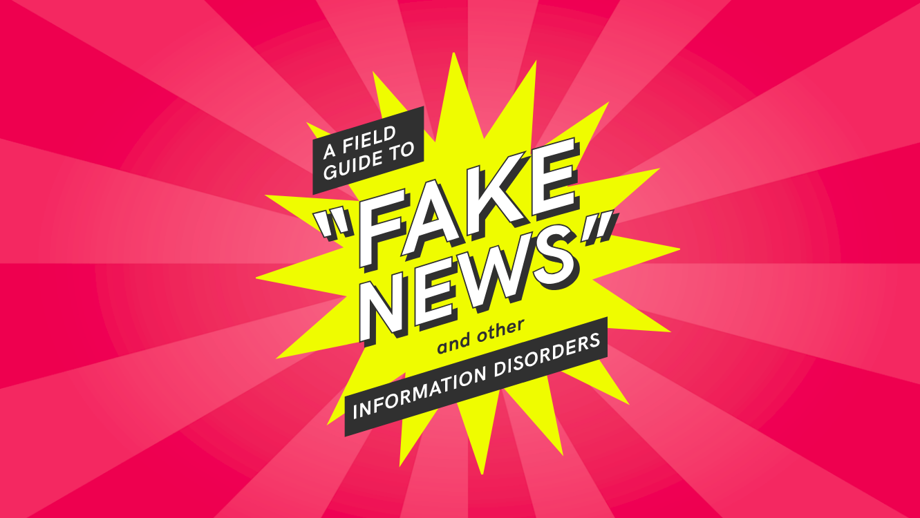
Yes. A good example would be A Field Guide to Fake News and Other Informational Disorders, conducted by the Public Data Lab in 2018 in collaboration with a number of researchers and designers. One of our aims was to make all the research and design processes transparent. The guide shares with the readers the context, questions, tools, visual models and design strategy of the visualizations, so that they can be replicated and modified. Another project I like very much is Scandaglio, as part of which I have the opportunity to collaborate with the OffTopic Lab. All of Scandaglio`s chapters are open and accessible on GitHub; each chapter uses diverse strategies for creating narratives using data-mixing approaches.
- Can technologies like Augmented Reality and Machine Learning expand the possibilities of making big/various data (and information mediated by them) sets more readable by us?
While I am fascinated by the technology and the possibilities it brings, I am sceptical that technological tools are the factors that will make data and information even more readable. Undoubtedly, new technologies, such as Augmented Reality or Machine Learning, as well as other ways and means of visual communication, will be developed, but I believe that whether they are more readable or not will always depend on the human capacity to read data and information. However we should be aware of one thing — a large proportion of the design and visualization process can be automatized in the near future.
- If so, then, how do you envision the visualization and visual communication in the era of automatisation and artificial intelligence?
Future technologies could be able to make visualisations automatically, deciding on their aesthetics, forms and strategies of representing information and the world in general. I am aware that it seem like something out of a science fiction film, but we may soon live in the era when representations of the world are created by machines and not by human beings!

